The True role of modern vaccines
Here are some graphs from reputable government sources which differ from those that are commonly used by anti-vaccine skeptics. In some of them you will notice clear depictions of mortality rates or the number of cases of common diseases that existed at various points in time. However, some of them contain information about infectious diseases in England.
But, in all of them, you will see that large portions of various diseases were indeed, dramatically reduced with the advent of improved health and sanitation measures but, were virtually eradicated after the use of vaccines became widely available. Remember also that death rates can be very low while the number of cases remains very high. Therefore such graphs may indicate large drops in either mortality rates or in the numbers of cases, both of which are not uniformly impacted by the other.
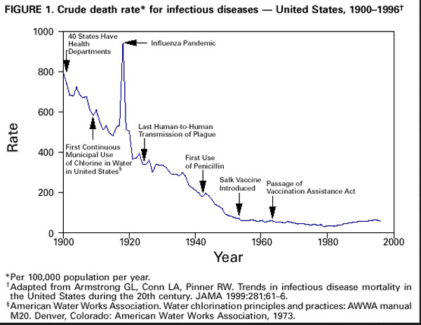
This first one is a CDC composite graph showing the crude death rate for infectious diseases, between 1900 and 1996. It clearly shows the benefits of better healthcare practices—including adding chlorine to water, the use of penicillin, the Salk Vaccine, and finally the introduction of MMR vaccines to combat infectious Illnesses. After the passage of the vaccination Assistance Act, as you can see, improved sanitation and better health practices alone don’t tell the entire story. However in the graphs below you can see how the true impact of vaccines on various infectious diseases helped to virtually eliminate several of them.
https://www.cdc.gov/mmwr/preview/mmwrhtml/figures/m829a1f1.gif
https://medium.com/@visualvaccines/graphic-proof-that-vaccines-work-with-sources-61c199429c8c
What should also be noted is the fact that, particularly on the following graphs depicting measles morbidity rates (the number of cases) and on graphs depicting large numbers of measles mortality rates—graph lines will normally fluctuate wildly, (as they may do on a lie detector graph) indicating that one’s body signals reveal that the person being tested Is lying. But, deceptive graphs which portray long smooth changes, are not truly representative of how the Measles progresses i.e. note the many zig zags along the horizontal axis of the measles graphs (below) which depict how the number of measles cases normally vacillates over long periods of time. So any graphs of the measles which depict long unvacillating or smooth changes should not be believed.
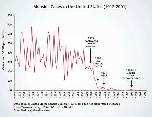
This graph notes about 250 cases per 100,000, when the first measles vaccines were introduced. Perhaps the discrepancy with it and next one below, is due to the fact that the first graph covers almost 90 year and starts way before 1950, while the graph below begins in 1950 and covers only 60 years. Also the vertical axis of the first graph represents cases per 100 thousand while the second one directly displays the total number of reported cases.
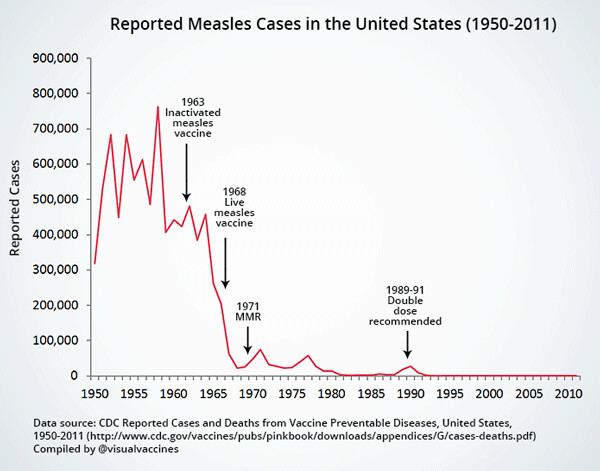
And in the 2ndgraph one can plainly see that when the inactivated Measles vaccine was introduced in the mid-1960s there were at least 450,000 reported cases, (including deaths), but in only a few years there was a precipitous drop in the numbers of cases!
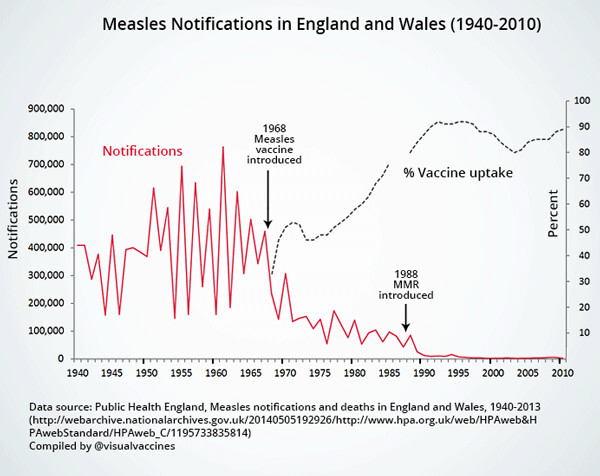
Similar changes for the better came about soon after a measles vaccine was used in England.
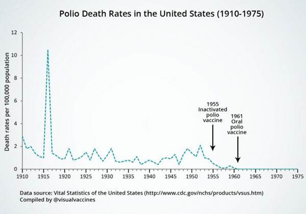
Polio (death) rates were indeed very high in 1915 and then took a dramatic drop, which could have been due to better healthcare practices.
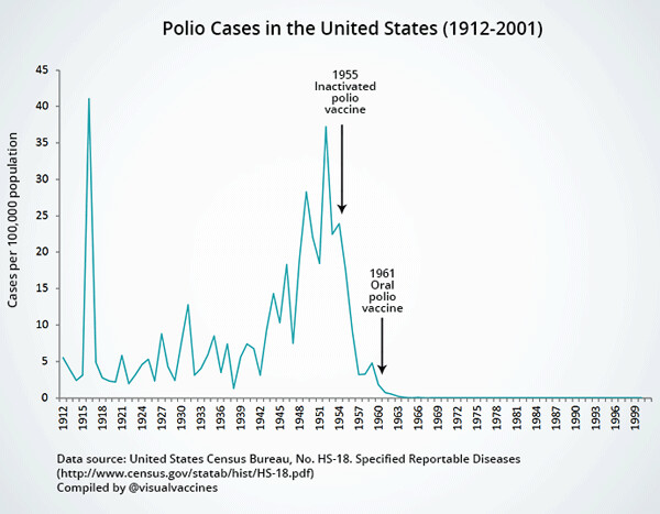
But when the number of polio (cases) is examined, nearly 40 cases per 100,000 in US population, existed in about 1953. However, in only a few years, the number of polio cases shrank dramatically until 1960. And it decreased even more, after the oral polio vaccine was introduced in about 1960—becoming virtually non-existent.
One of my cousins contracted polio in the mid-1950s and we heard he might have to have his legs amputated. After he was given the vaccines, he recovered from his illness and walks today with only a slight limp—which is a prime example of how various symptoms of any harmful illness also need to be eradicated--since death is not the only negative outcome possible.
Modern day parents don’t share the history that people like myself lived through, so it is easier for them to believe that their children were made worse, or even killed in large numbers, by common vaccines.
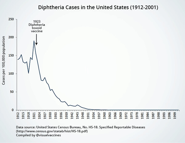
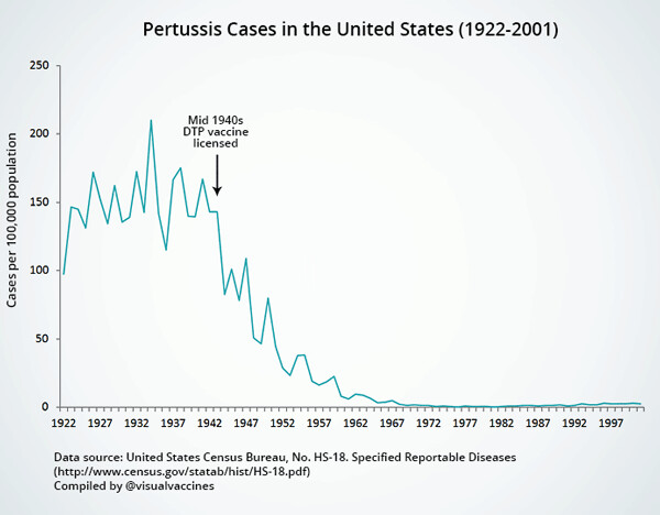
The same goes for diphtheria and pertussis cases, both of which dropped dramatically after vaccines were available to overcome them.
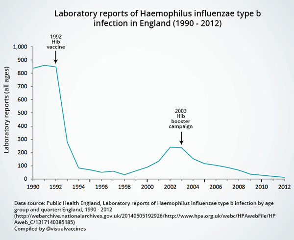
In England, Haemophilus Influenza type b also took a dramatic drop from 1992 until 1998. And then in 2003, a 2ndreduction took place in only about 9 years—until the hib booster campaign virtually eliminated the disease. It’s also important to note that in the 1990s sanitation and better health care practices were virtually equal to those of today--so how can sudden decreases in infectious diseases be due (only) to improved health care and sanitation?
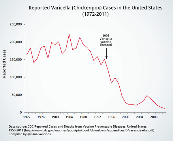
A similar dramatic drop in Chickenpox cases began around 1993-or 94, when health care standards were also equal to any of those of today.
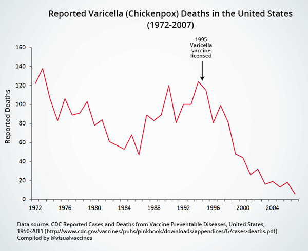
The same is true with chickenpox mortality (death) rates.
As you can see, (going back to the first graph), the use of various vaccines has dramatically reduced infectious diseases and many tragic outcomes were prevented with the help of improved health and sanitation measures—like the use of chlorine in water, penicillin, the Salk vaccine, and diphtheria vaccines. So, altogether the actual numbers of deaths caused by a lack of proper healthcare and hygiene, when alleviated, did greatly reduced the numbers of harmful diseases! However, the use of modern vaccines obviously did a great job on all remaining infections.